Programs--scientific ones, at least--tend to generate lots of data. You have already seen examples of this in the C-language primer document, and you will see many more. Once, you had little choice as to what you could do with those data. You could only print it out and look at it in the form of columns of figures on the screen. Pretty dull...!
Often, the best way to represent a large dataset is in graphical form. At its simplest, this may just mean drawing simple line graphs. In more sophisticated contexts, you may end up making an elaborate 3-D movie, complete with audio track, to illustrate the Physics and explain your findings to others. Such sophisticated visualization is more an art than a science, and usually calls for specialized hardware and software (although you can actually get quite far without leaving our lab).
#include <iostream>
#include <cmath>>

#define N_POINTS 1000
#define XMIN 	 0
#define XMAX 	 (4 * M_PI)	/* this is just 4 PI; M_PI defined in math.h */

main()
{
    int i;
    double x;

    for (i = 0; i < N_POINTS; i++) {
	x = XMIN + i * (XMAX - XMIN) / (N_POINTS - 1);
        cout << x << "  " << sin(x) << "  " << cos(x) << "  \n";
    }
}
This will produce 3 columns of data, with 1000 rows in each, listing
the values of x, sin x and cos x, for values of x linearly spaced
between 0 and 4 PI.In the simplest possible case, to draw a graph of, say sin x versus x (column 2 versus column 1), we must do the following:
As a way to practice, use the program above to generate data to be plotted in gnuplot. If the program is stored in c1.c, do
The with keyword specifies how to draw the data points: drawing a line between points, points, lines between the x-axis and the data points, lines and points, or small dots. Each keyword can be brutally abbreviated, e.g., w can be used for with. lw specifies the line width (default 1). lt specifies a line type and ls specifies a line style. The command test shows the default line types. ps specifies the point size.
Gnuplot allows much customization and flexibility. For instance you can specify line style 55 (arbitrary number) of a given color and width and plotting with line only or with lines AND points.
You can identify your graphs via
//                       sin*cos program
//
//              Illustrates a surface defined by f(x,y)

#include <iostream>
#include <cmath>>

#define N_POINTS 250

main()
{
    int i, j;
    double x, y, z;

    for (j = 0; j < N_POINTS; j++)
	for (i = 0; i < N_POINTS; i++) {
	    x = 2*i*M_PI/(double)(N_POINTS-1);
	    y = 2*j*M_PI/(double)(N_POINTS-1);
            z = (1 + sin(x)*cos(y));
	    std::cout << x << " " << y << " " << z << " \n";
	}
}
Compile this program, and run it with a pipe into
a file sin_cos_data. Start gnuplot and issue
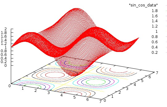
Gnuplot can also produce contour plots. This is somewhat complicated in this case since the data is given numerically from a file. The idea is to let gnuplot know that the data is given numerically on a grid of size 200x200 (third number is a weight to be ignored), enable the contour option and plot the surface AND the contour lines.
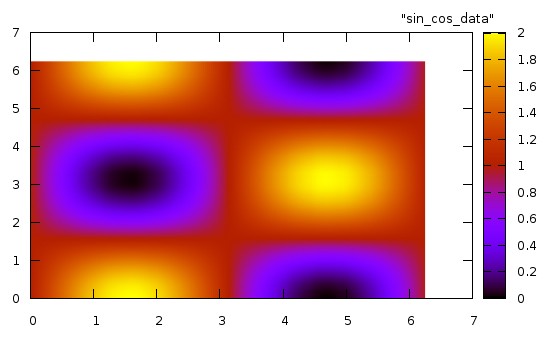
The idea of representing data by an image is very simple. The data are calculated on a rectangular grid in x and y, of dimension m by n, say. Each pixel in the final image represents a point in that grid, and the color assigned to the pixel represents the value of f(x,y) at that point. The mapping between the value of f and the color assigned is entirely up to the programmer. Typically it is chosen to enhance or emphasize certain features of interest in the data.
Often the color resolution of our screens allows us to display up to 256 colors simultaneously. This number is chosen because integers in the range 0 to 255 can be represented using a single byte of data--an unsigned char in C. Of course, there are many ways to choose these colors. The mapping between the integers 0 to 255 and the final color that appears on the display is called a color map. The standard color map we might use looks like this:

There is no particular reason for this choice--it is simply convenient. Small numbers correspond to blue, large numbers to red, and intermediate numbers to intermediate colors in the ``spectrum''.
To X, an image is a collection of bytes, one per pixel, along with a color map telling the display how to ``paint'' the screen. There are many different image formats in use -- gif, jpeg, miff, xpn, to name but a few. Fortunately, we don't have to know how to construct them all. The program convert allows us to turn one into another.
Gnuplot allows to create color images. For instance, the following will create a color image of the data set we look at previously.
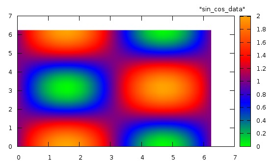
You can create your own color palette as well. For instance
Matrix notation
Gnuplot can read the 2D data on an equally spaced grid via a matrix notation. Namely, the following Gnuplot statements could plot an image of the data
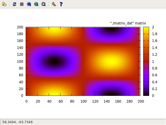
The file
//                       sin*cos program
//
//              Illustrates a surface defined by f(x,y)
//
//                       Matrix format output
//
#include <iostream>
#include <cmath>>

#define N_POINTS 250

main()
{
    int i, j;
    double x, y, z;

    for (j = 0; j < N_POINTS; j++)
        for (i = 0; i < N_POINTS; i++) {
            x = 2*i*M_PI/(double)(N_POINTS-1);
            y = 2*j*M_PI/(double)(N_POINTS-1);
            z = (1 + sin(x)*cos(y));
            std::cout << " " << z ;
        }
        std::cout << "\n";
}
Note that the x- and y-coordinate are labeled by a matrix notation, the actual values being lost. But it is so simple...
There are numerous examples of how to create color images of data and functions on the gnuplot homepage. There are also many examples of color palettes.For instance, the file gnuplot_script could contain
#
#   example of a gnuplot script file
#
set title "a simple plot"
plot "data_file" using 1:2 with dots
quit
This file is then piped in gnuplot via the syntax
gnuplot -persist < gnuplot_script
The keyword -persist guaranties that the plot will stay in the window until you type q. Not using this keyword will cause gnuplot to close the plot immediately once drawn.
This scripting capability allows the user to develop complicated plots piecewise and record the way in which they were produced. This provides a way to submit your work in assignments.
plot "-" u 1:2 w lines
opens up an interactive query for data which remains active until e is entered.plot "< ./executable_code" using 1:2 with lines
will launch the executable executable_code in the local directory and accept the data it outputs in stdout for plotting.
This syntax is very powerful in that it embodies fully the Unix pipe concept and avoids the creation of data files. When combined with gnuplot scripting this becomes a very powerful technique to facilitate your work.
//
//           to illustrate the use of C pipes
//           to communicate with gnuplot
//
//                      Michel Vallieres

#include <stdio.h>
#include <math.h>

int main()
{
  FILE *fp;

  fp = popen( "gnuplot -persist", "w" );

  fprintf( fp, "set title \'Whatever\'\n" );
  fprintf( fp, "plot \'data_file\' using 1:2 with lines\n" );
  fflush( fp );

  sleep(5);
  fprintf( fp, "quit\n" );

  pclose( fp );
}
launches gnuplot with a persist option, pipes commands
to plot the data in column 1 and 2 in the file data_file
and quits. Try the code with the following simple data.
1 2
2 1
1.1 1.2
1.5 0.5
2.7 0.7
The following C and C++ codes (identical in function) illustrate the very similar syntax to set-up these graphics in the two languages.
sample codepopen( executable, type )
launches an executable and opens a pipe to communicate with it. For convenience, the communication fully follows the syntax used in reading/writing from/to a file. The pipe channel can either read from the launched process (type ``r'') or write to the launched process (type ``w''), but not both. The pipe will either read from stdout of the launched process or write to its stdin depending on the type specified in the popen() call.
The following three codes illustrate the use of popen(): code_main.c, code_a.c, and code_b.c Compile each code. It is important that the executables be called code_main, code_a and code_b. Then run code_main. It will launch the other two codes and communicate with them.
Study these simple codes well. They illustrate the notion of parallel computing in which multiple processes work together toward a task.
    gpl:       minimal subset of gnuplot commands, with data from stdin

    Options:   -c i j k...     columns to plot (x y1 y2...)       [1 2]
               -f              linear fit to first plot            [no]
               -F x1 x2        x limits to fit            [plot limits]
               -g    specify X-window geometry     [xdefault]
               -G              toggle PNG graphics output         [off]
               -h header       specify an overall header         [none]
               -k              suppress key giving column info     [no]
               -l x1 x2 y1 y2  specify plot limits          [automatic]
               -L size         specify plot limits (+/- L)  [automatic]
               -p              toggle points/lines             [points]
               -P              toggle PostScript output           [off]
               -s script       save the script in the named file   [no]
               -x              specify x-label                   [none]
               -y              specify y-label                   [none]
               -Y a b ...      specify plot labels    ["column j", ...]
The script works by first copying the piped data into a temporary
file in /tmp. It then
creates a gnuplot script that implements the required options in
/tmp.
It finally launches gnuplot to execute the script and erases
the tmporary files.
You can list the script by typing
Dr. McMillan wrote and maintains Gpl. A description of
it can be found in
PHYS105.
The program plot_image.py accepts the values of f(x,y) on an x - y lattice though a pipe in stdin. Download the code. Make the code executable. This program is a python code based on functions found in matplotlib.
The calling syntax of plot_image.py is
./executable | ./plot_image.py -s Nx Ny -c nc [-h] [-g] -t titleThe size of the image in pixels is specified as a command line argument (-s Nx Ny, dimension of the x - y grid). The program also accepts the optional -h or -g which specify alternate color palettes. The -t title specifies a plot title. The -c nc argument toggles on the contour display with nc lines.
The following simple codes can be used to practice the use of plot_image.py. gen data.c and gen_data_rectangle.c produce sin() cos() based data on square (200x200) and rectangular (300x200) lattices. Gen_data_sharp.c produces a two-color image (2 value data) with a sharp boundary.
Details:
#
#   plot_image.py
#
#   Step 1: make this file executable
#
#           chmod +x plot_image.py
#
#   Step 2: pipe data in python script
#
#           ./gen_data | ./plot_image -s nx ny -c nc -t 'image title'
#
#   with optional arguments
#          -s nx ,ny    image size [16x16]
#          -c nc        number of contour levels [none]
#          -t ' '       image title ['some like it hot']
#
#   additional:  -g  gray map  [jet map]
#                -h  hot map
#
#   ref: matplotlib web site